 |
| The positioning of the boy and and how they are presented is very important. The five boys are presented completely across the front cover with most of the magazine from cover being occupied with them with not a lot of background to show. This has been done to make the main focus of the magazine cover on One Direction and the magazine has done this for a unique selling point to brand out to people who like the bang One Direction. All the boys are presented with high key lighting. This is done to reflect on the personality of the boys as they look bright maybe enabling them to come across as happy and joyful people, along with a few of them smiling. The colour of the font used mainly was pink, this is due to the magazine aiming more towards women. This is another reason why using One Direction on the front cover is a great idea because the majority of One Direction fans are girls and women, therefore by putting them on the front cover it might give people an extra reason to buy the magazine. 
Justin Bieber is positioned in the middle of the magazine due to the fact of Justin Bieber being the unique selling point of the issue of the magazine. Doing this enables Justin to be the main focus of the magazine cover. Justin Bieber also seems as if he is staring straight at us, this is due to him looking into the camera. This is very effective as it enables the feeling that the music artist is communicating and making eye contact with the buyer.
Yet again the main font used which stands out the most is pink, this could be because maybe this is a magazine which is branded more towards females. Doing so, Justin Bieber is the ideal person to have on the front cover as Justin Bieber as well as One Direction which have females as the majority of their fans. Therefore this would make this magazine more appealing to a wider range of people whilst promoting Justin as well.The background of this magazine front cover is blurred out, the reason that this was done was to make Justin Bieber stand out more and make him the complete focus of the front cover. |
Sunday, 4 January 2015
Magazine front cover analysis

Sunday, 14 December 2014
Justin Timberlake album cover

With Justins's positioning and posture, it makes him come across as an important person. The way this is done is by Justin being frames in the middle of the album making the persons focus on Justin as there is nothing else in the frame other than him. With Justin's posture it makes Justin seems like he has a lot of pride and he feels of great importance.
With the title of the album being black and orange, this could have been used to represent Justin's personality just through the use of colours as he could come across as split personality having a bright and a bit of a different side to his personality.

With Justin's costume the the prop in his hand, it makes him seem a high class person as these sort of props such as his hat and his stick are usually quite high class and posh items.
Thursday, 11 December 2014

Monday, 8 December 2014
Album covers

This is a album cover for Justin Bieber called 'BELIEVE'. There is a close up image of Justin Bieber's face on the middle of the cover. This close up is to promote the artists image to the public. Bieber's face is turned as if he is looking for something or looking at somebody. This can also suggest that he needs motivation to believe in what he is good at which is music. This is because of his facial expressions. The background is a dark colour which suggests.The Title of the album is printed across the front of the screen in capital letters which font is a lot bigger than the size of the artists name which is only in small font at the top of the album.
Thursday, 4 December 2014
Construction Post
Filming at the park
This was a successful shoot however, we didn't have the right weather (light) that we would have preferred to suit the theme and genre of the music video. However, we managed to get key shots that was needed for the video. There also wasn't a lot of space on the memory stick which meant that we had to decide on which footage to keep as there wasn't enough room on the card. whilst filming I found it quite difficult as the music wasn't loud enough for me to sing over, therefore my performance wasn't as strong as it could have been. The theme and idea that we wanted behind the footage that we filmed was that the lead singer and the actress are having a good time and are laughing and playing about. This would explain why he wants to tell the world how he feels about her. This also shows the relationship between the couple.
Filming on the sofa
This wasn't done as efficiently as I would have liked it too as we could only do one shot all the way through as there wasn't enough space on the memory card. This meant that we couldn't get every angle that we could have got to play about with the different shots. However we did manage to get the key frame that was significant to the piece. I think that we will need to reshoot this to get different angles and different perspectives. However, the lighting was effective as it was high key lighting which allowed the artist to look effective. Again with this we wanted to show the relationship between the couple so we did some shots of them laughing and talking on that sofa. We also filmed the lead singer singing to the actress, this will help pull the video and the scenes together.
As a whole I think we need to reshoot some of the footage we already have as there isn't enough, and the quality of the footage isn't as high quality as we would have liked.
This was a successful shoot however, we didn't have the right weather (light) that we would have preferred to suit the theme and genre of the music video. However, we managed to get key shots that was needed for the video. There also wasn't a lot of space on the memory stick which meant that we had to decide on which footage to keep as there wasn't enough room on the card. whilst filming I found it quite difficult as the music wasn't loud enough for me to sing over, therefore my performance wasn't as strong as it could have been. The theme and idea that we wanted behind the footage that we filmed was that the lead singer and the actress are having a good time and are laughing and playing about. This would explain why he wants to tell the world how he feels about her. This also shows the relationship between the couple.
Filming on the sofa
This wasn't done as efficiently as I would have liked it too as we could only do one shot all the way through as there wasn't enough space on the memory card. This meant that we couldn't get every angle that we could have got to play about with the different shots. However we did manage to get the key frame that was significant to the piece. I think that we will need to reshoot this to get different angles and different perspectives. However, the lighting was effective as it was high key lighting which allowed the artist to look effective. Again with this we wanted to show the relationship between the couple so we did some shots of them laughing and talking on that sofa. We also filmed the lead singer singing to the actress, this will help pull the video and the scenes together.
As a whole I think we need to reshoot some of the footage we already have as there isn't enough, and the quality of the footage isn't as high quality as we would have liked.
Monday, 1 December 2014
One Direction - Up all night album cover

One direction is a group made up of five young boys. This is one of their album covers. Every single one of the members in the group are wearing bright colours of clothing and mainly of a similar colour. This is done to help present the boys personalities as bright and a positive one. This is done to help the audience feel as if they know the band of boys and it helps the audience to understand what sort of people the boys are by what they are wearing, for example if they were to all have hoodies up and were in a tracksuit they might stereotypically be seen as anti-social.
All the boys on the cover are smiling, this is extremely essential as they are a pop group and pop songs are never usually sad, therefore the smile is vital in putting across a positive vibe about the group and it almost give across the sense that they are just like brothers by the way they all seem to be very happy with each other with how their arms are around each other.
With their arms being around each other which is another deliberate action they done on purpose. The reason for this is to make all of them seem as a family and to make them come across as kind, happy and loving people to their fans. They also look like they are having fun, therefore they come across as people who like to enjoy themselves which then reflects the title of the album which is 'Up All Night' ,which if you was to assume what the album was about from the title then the assumption would be that it is a party album which would they be seen as a typical pop selection of songs.

The use of the boys running together shows what sort of music group that they are. It shows that they are fun people and enjoy having a laugh and having fun, which helps to present their personality to their fans.
The music label SONY also used this as a chance to promote themselves by putting their name on the back cover of the album.
Album cover Research
Christina Aguliera: Back to Basics
 The image that is used of her seems innocent but could also be seen as seductive. This is to make the target audience know what sort of songs are going to be on the album. There is use of high key lighting to help persuade the audience that she is innocent while still sexy. The red text and red lips also suggest danger and passion. This also stands out from the yellow glow of her skin. The artist name is smaller then the text which suggest that the name of the album is what the artist want to stand out the most. The name of the album also suggest that the song that are going to be on there wont be today modern music and that it is influenced from the past.
The fact that she is laying down with what looks like a quilt could suggest that she feels emotional.
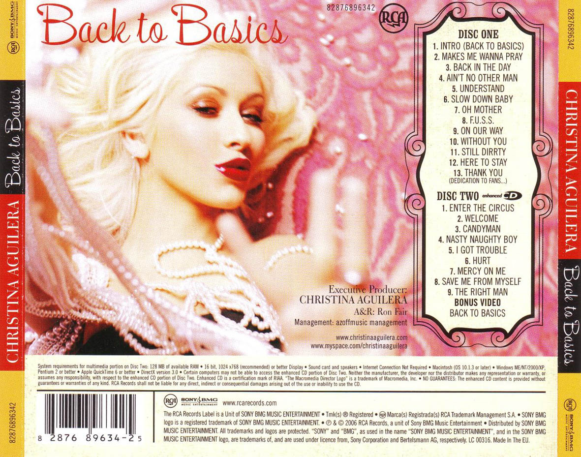
The back of the album is pink which suggest that the album is going to be girly and that the target audience is going to be girls. The fact that the artist is posing her lips like she is singing suggest that she is trying to be seductive to the male target audience. The necklace that she has around her neck is beeds which suggest that the IRA that the music is going to be set in is around the 1920s- 1940s. The image isn't in focus which suggest that they wanted to capture an in the moment image. The back also has the record labels logo on it.
Sam Smith: The Lonely Hour
 The image that is captured of him seems to be a glance of the artist feeling emotional. This suggest that the songs that are going to be on the album are going to be slow and about his feelings. This also suggest that the songs are going to be personal to him. The fact that the background is dark could also suggest that he feels he has been kept in the dark about something and the lights that are placed on him could represent him coming out and singing about how he feels.The fact that the name of the artist is large suggest that the artist name is a branded name and is what is going to help sell the albums. The name of the album is underneath and is slightly smaller then the name of the artist. The fact that it is written in white suggests that it is pure what he is singining about.
  The colour of the back is black and the colour of the text is white. This is so that the text stands out from the black. All the text is written in the same font and is underneath each other. There is also the artist name and the tittle of the album in a larger font. There is also light gapping in as though there is a windows reflection shining on the album. There is also the record labels logo and the bar code.
Olly Murs Right Place Right Time

The main feature of the front cover of the album is the artist, as he is standing in the middle of the photo looking straight at the camera. There is also the use of high key lighting so that his whole face is showing, because there is high key lighting it makes the white top even whiter, this makes him seem pure and innocent which makes him more appealing to the target audience. This makes the Album seem intimate as its as if he is looking straight at the audience.The costume that he is wearing seem quite old fashioned which makes the album seem authentic and old fashioned. The text of the album is in white, black and red. This makes the album seem fun and playful which represents the songs that are going to be on the album.
 The back cover like the front are quite similar, however the songs are written on the left of the back and are all in a black bold font. All the text of the song tittles is written in black which makes it stand out from the white writing behind it. There is also the bar code at the bottom of the album along with the record label and music produces. There is no red so it doesn't stand out as much as the front but it is still effective.
Subscribe to:
Posts (Atom)